Have you ever opened a bag of chips to find it only about 1/3rd full?
Or, how about, have you ever tried to use an Apple charger in an electrical outlet but couldn’t because one was already there, taking up all the space?
Those are both examples of “asshole design” and quite the opposite of what these following products and features are all about.
Turns out some designers, for no reason and often at the expense of the company, design their products to make them easier, more informative and generally helpful.
Known as “anti-asshole design,” there’s a whole subreddit devoted to examples of what they call “design that benefits the user at the expense of the company. Any feature, however easy to implement, that helps the user and makes the company no money (and cannot be advertised) is anti-asshole design.”
Here are some of the most clever examples of “good,” anti-a**hole design.
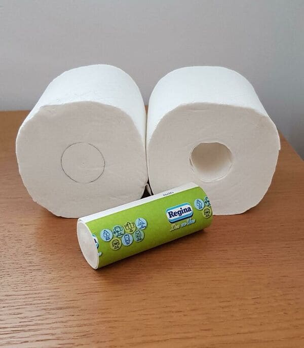
1. Whoever designed this toilet paper roll that includes a mini-roll inside, instead of a hollow tube.
2. The designer of this sign that someone “found in the ladies’ restroom.”
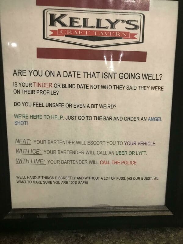
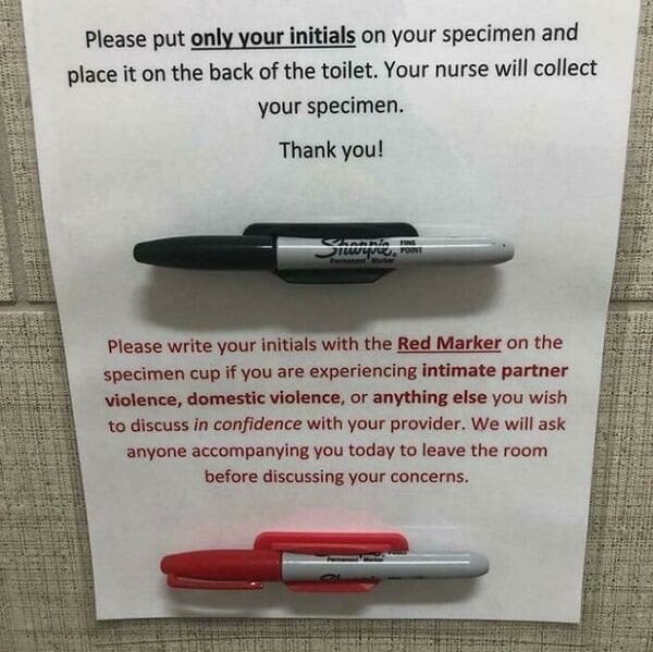
3. Whoever came up with this subtle way to offer aid to domestic violence victims.
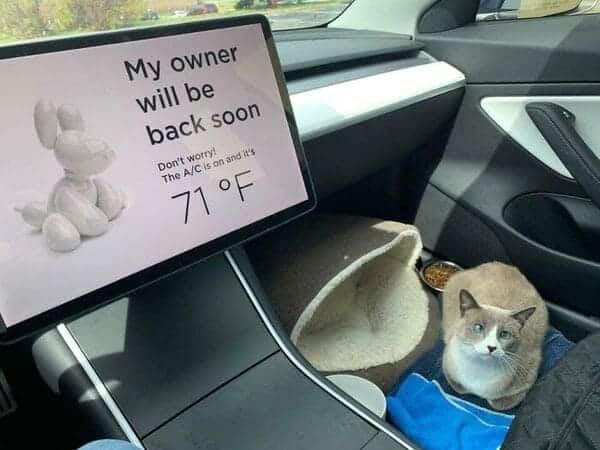
4. Tesla’s interior tech designers.
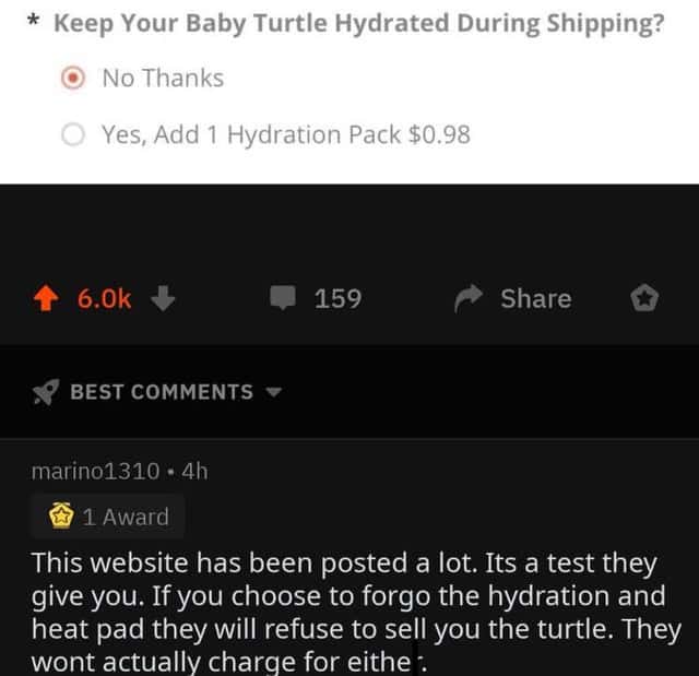
5. The people behind this service for buying a pet turtle.
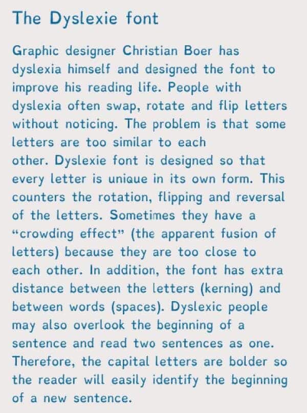
6. The inventor of the Dyslexie font.
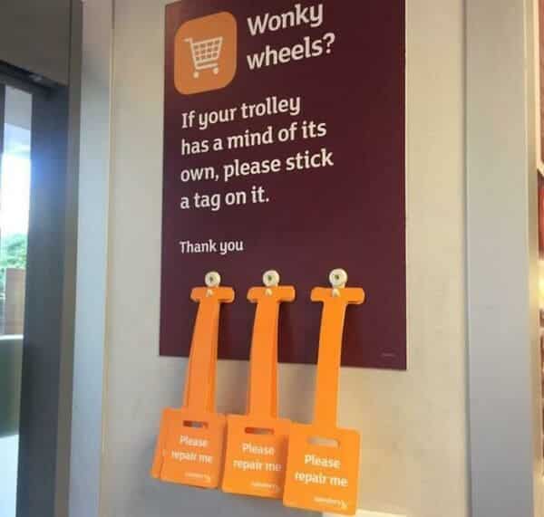
7. Whoever came up with this easy way to get shopping cares repaired.
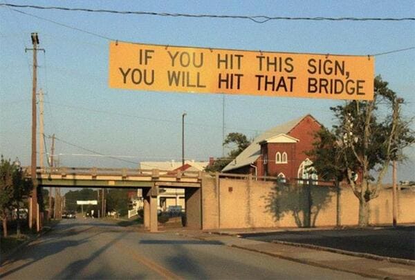
8. The city planner who was tired of his bridges getting hit.
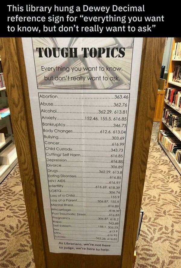
9. These librarians.
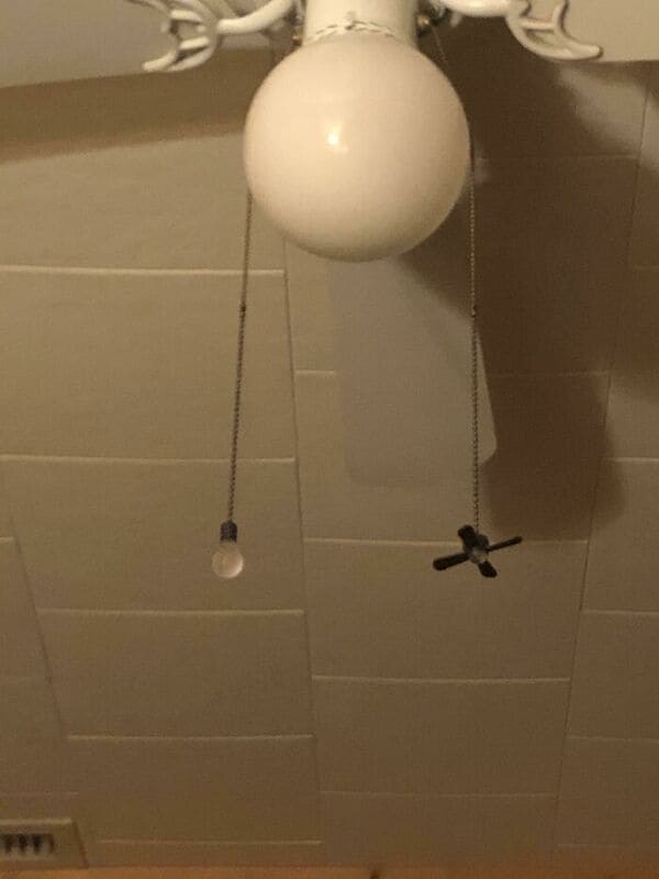
10. The inventor of these strings that show you which is the light and which is the fan.
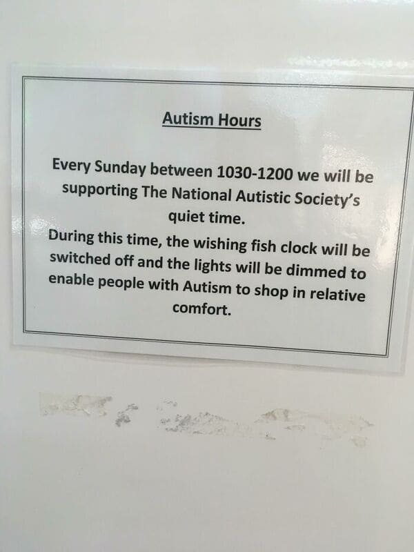
11. This local shopping center that has a designated time for being Autism friendly.
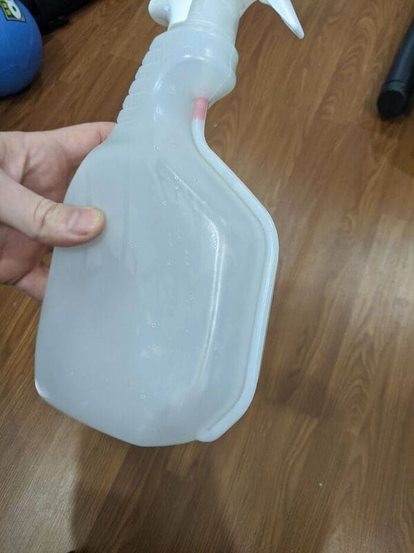
12. The inventor of this spray bottle that makes sure you get to use all the liquid in it.
13. This designer, who figured out how to keep a-holes from making new accounts.

14. The makers of this sardine can with a transparent lid.

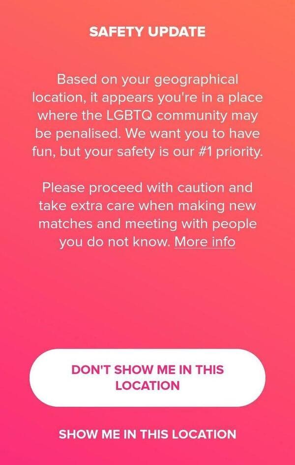
15. The designers at Tinder, who have your back even when the government doesn’t.
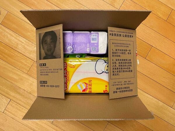
16. This company in China that uses its shipping boxes as flyers for missing people.
17. The moderators of Reddit, who show you this warning before you enter the Anti-Vax communities.

18. The people who gave us this friendly reminder.

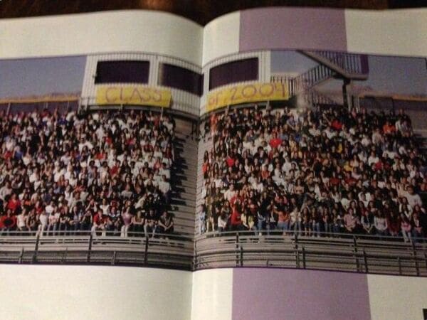
19. This photographer, who planned ahead by adding a gap in the picture to avoid losing people in the binding.
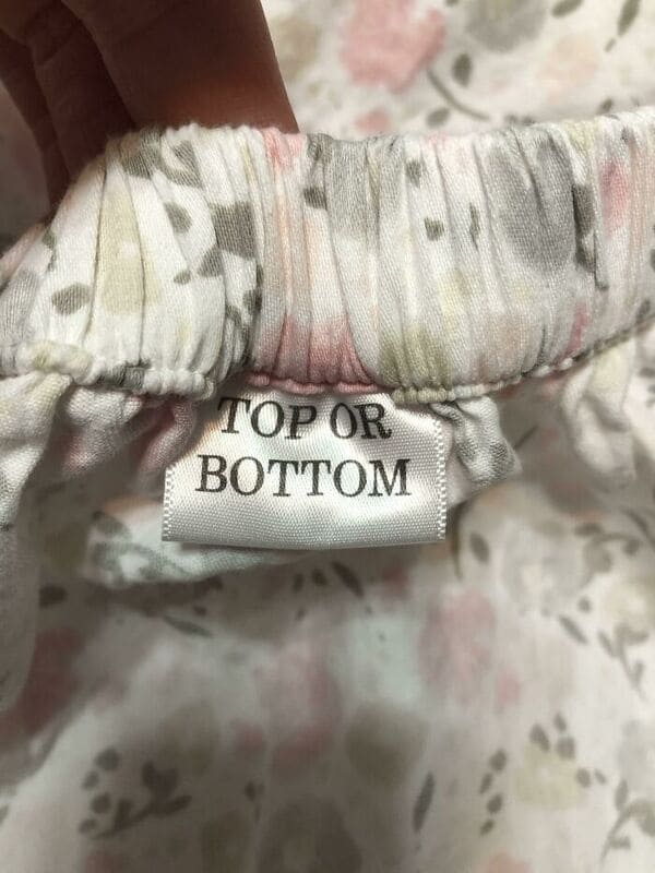
20. The makers of this fitted sheet tell you if it’s the “Top/Bottom” or the “Side.”
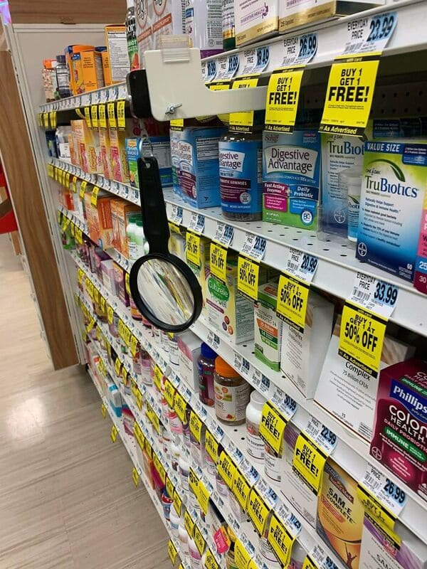
21. Rite-Aid puts a magnifying glass by its products people can read the medicine labels.
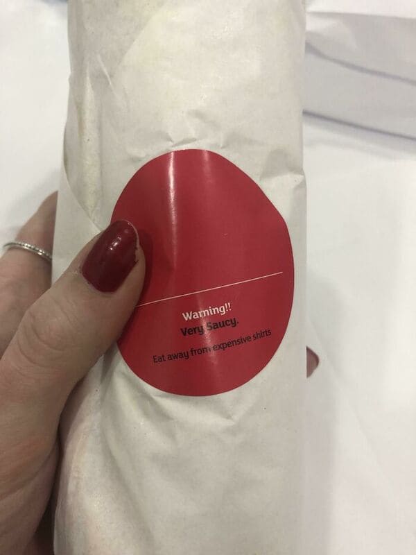
22. The makers of this sauce warning.
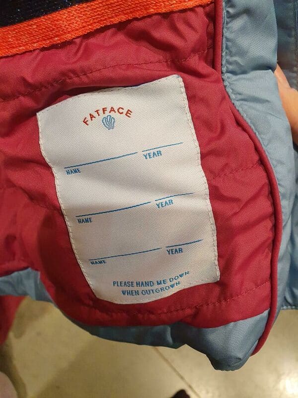
23. This Children’s clothing company that prepares for multiple owners of a hand-me-down coat.
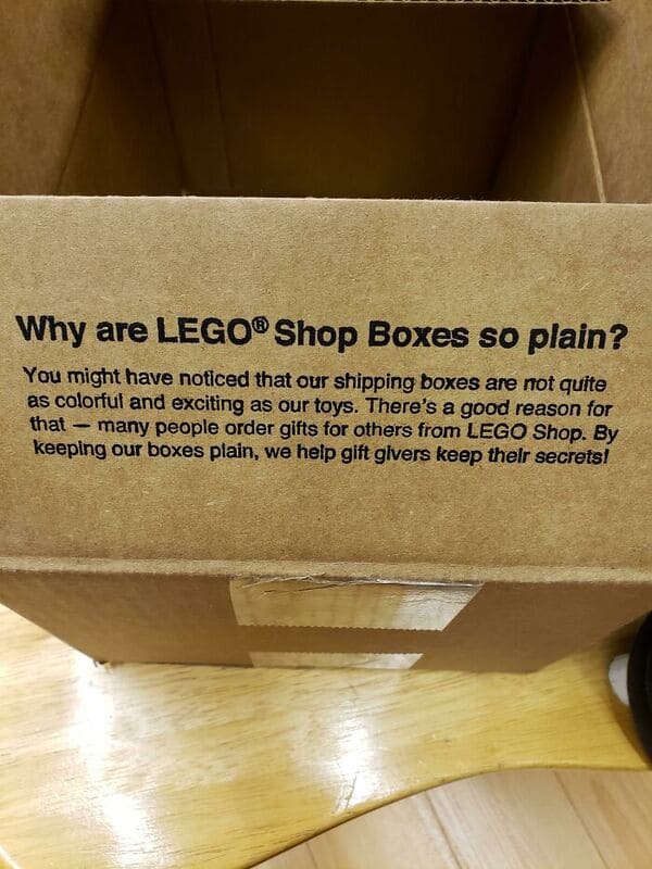
24. The people at LEGO.
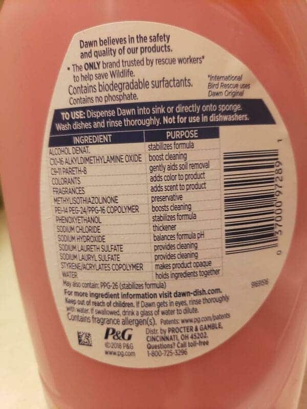
25. Dawn’s genius idea to actually tell me what all these chemicals do.
26. The makers of this game.

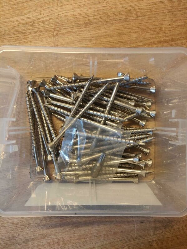
27. The makers of these screws, who include the bit needed to put them in.
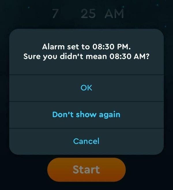
28. This alarm app that’ll save you from a frantic call with your boss.
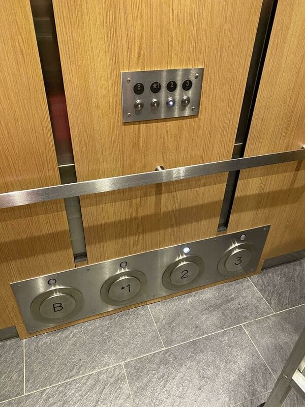
29. The makers of these anti-germ elevator buttons.
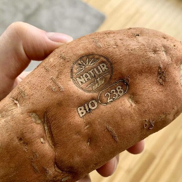
30. This potato company using a hot stamp instead of an annoying sticker.
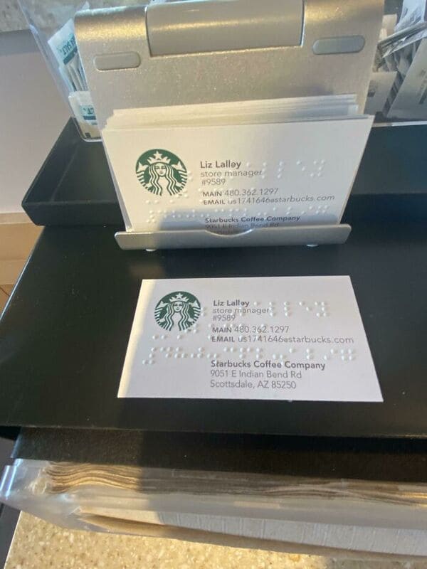
31. Starbucks for making business cards with braille and text on them.
32. The makers of this metal slide that has a hose to cool it off in the middle of summer.

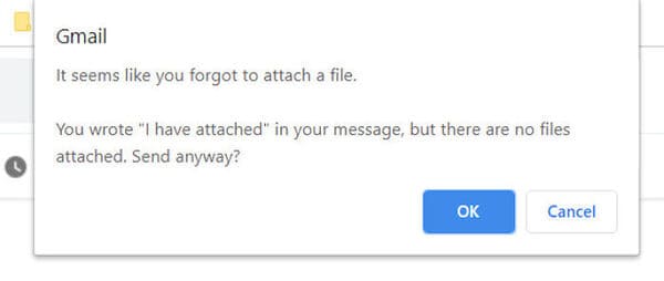
33. That maker of that feature on Gmail that tells you if you wrote “attached” but forgot to attach something.
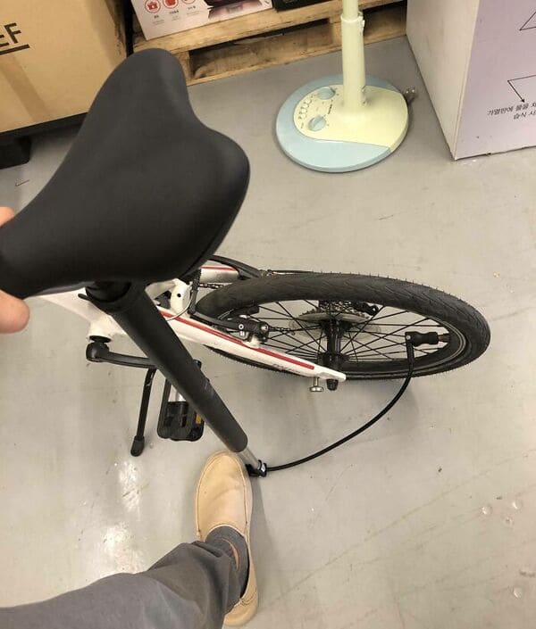
34. The designer of this bike seat/built-in bike pump combo.
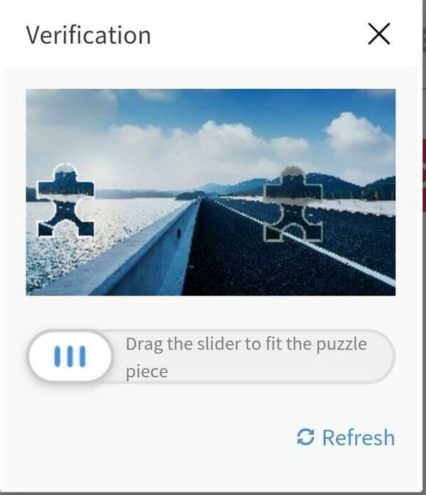
35. The makers of this easier-to-use Captcha alternative.
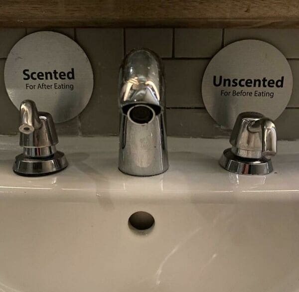
36. This bathroom designer.
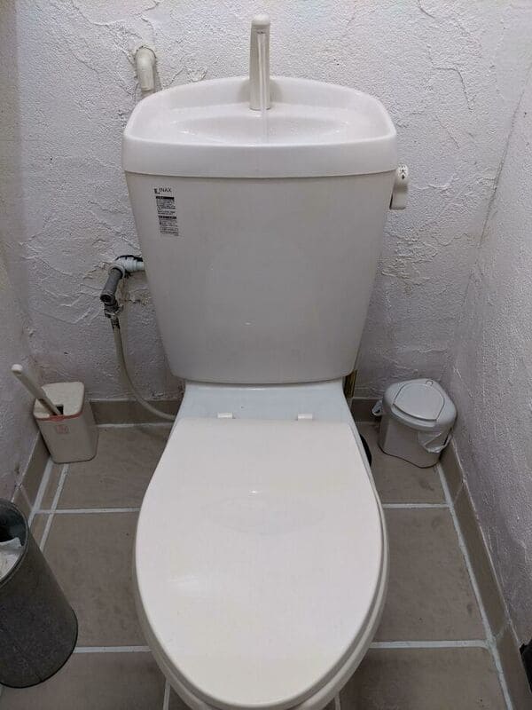
37. The designers of this toilet, who made it so you can wash your hands with the water that fills up the cistern after you flush.
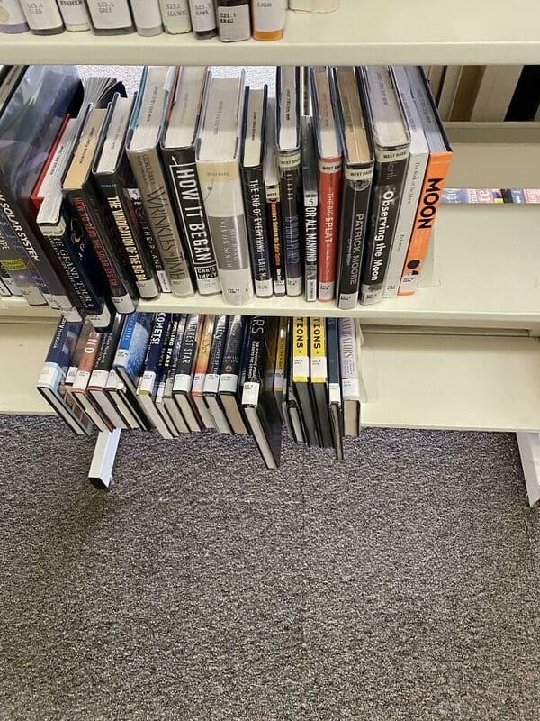
38. The librarians who put the books at the bottom spine-up so you wouldn’t have to bend down to see.
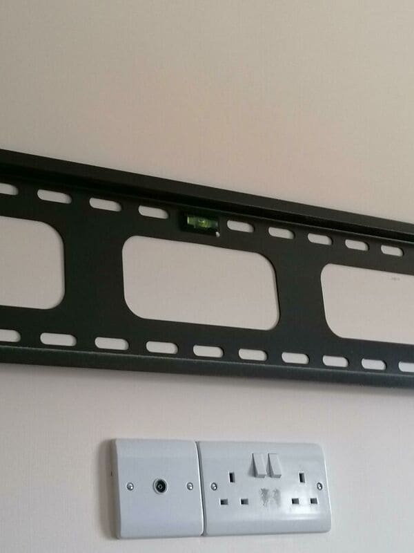
39. The designer of this TV mount knew you’d need a level to hang it, so they included it as part of the mount itself.
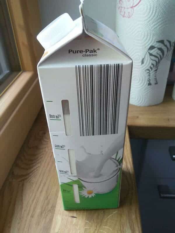
40. Pure-Pak’s designers made it so you could see how much milk was still left in the container.
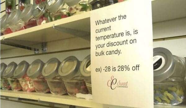
41. This candy store, that gives a discount based on how many negative degrees it is outside.
42. The designers behind this giant unsubscribe button.

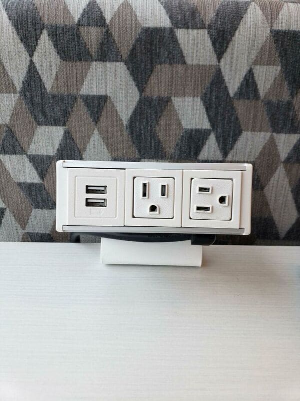
43. The makers of this outlet designed offset by 90 degrees so more than one charging adapter could fit at once.
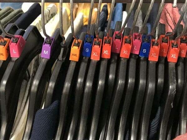
44. Whoever thought up putting the size on the hanger so you can see without taking it off the rack.
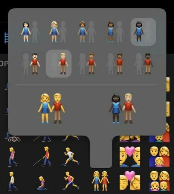
45. Apple’s designers thought about how hard it is to define relationships these days.
46. Disney + jumps you to this scene when you “Skip Intro” so you don’t miss a Simpson’s couch gag.

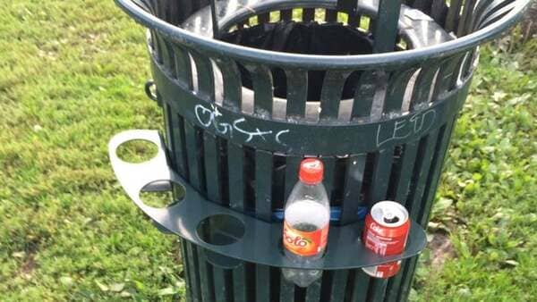
47. “In Norway, you get a small amount of money for recycling bottles/cans. They’re often collected by poor people, the homeless, etc. A lot of our trash cans have these holders around them so people don’t have to search through the trash to collect them.”
48. Amazon designed it so you can either cancel now and get your money back or enjoy the rest of what you paid for already.

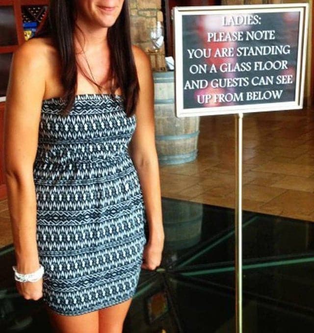
49. This restaurant thought to warn women of pervs.
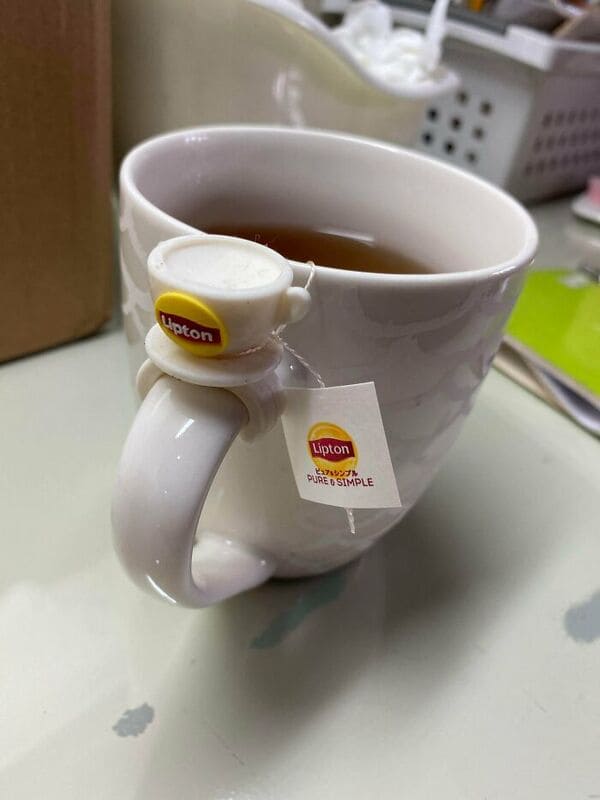
50. Lipton designers gave us a teabag holder that comes with the tea.
