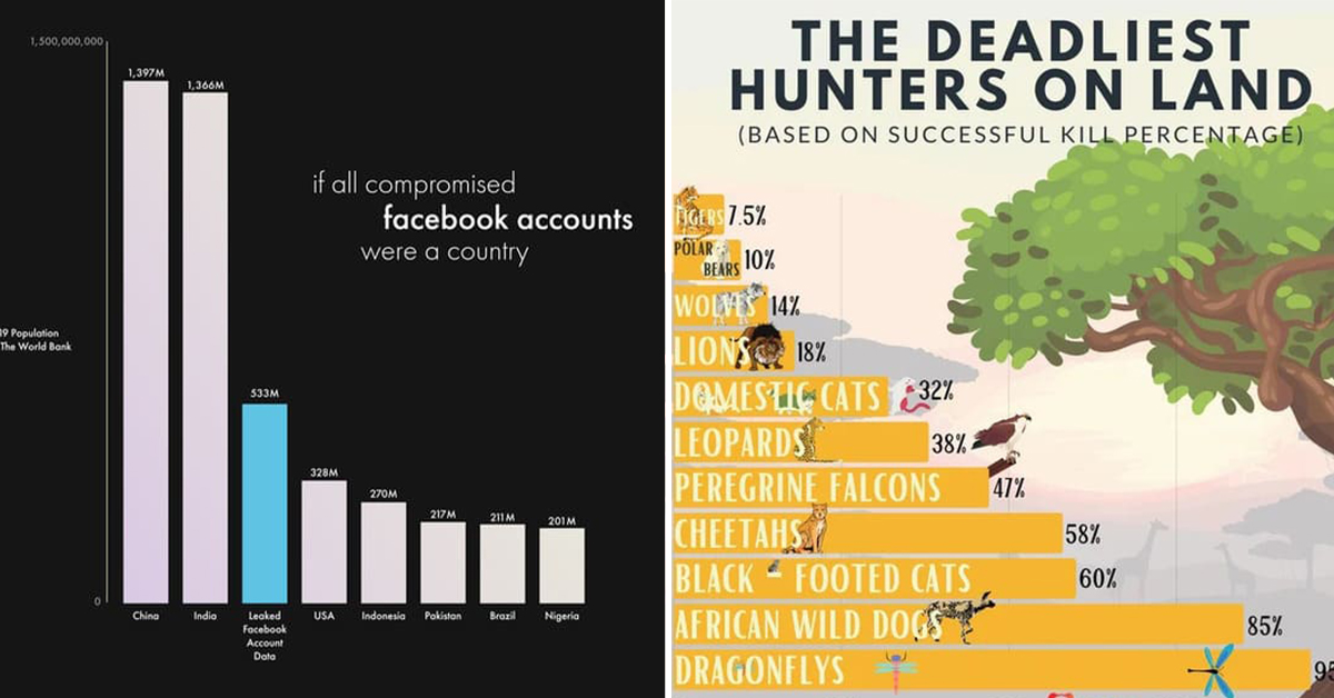
Data Is Beautiful (20 Photos)
Data is beautiful if you take the time to put it all together correctly. Sometimes, it adds up to something pretty. Numbers are for nerds! I like my information visual. That’s why I watch the news. I want to see a video clip of the thing I should be angry about today. Don’t make me read! That’s what Twitter is for. And my stack of erotic paranormal romance novels.
Frankly, I’m a dumb person. I blame myself. I know more about a map in Super Metroid than any map of the Earth. That’s why I’m happy people on Reddit gave me data that is digestible and fun to read. I hope you enjoy it as much as I do.
Here are the best examples of maps and graphs that became pieces of art simply by crunching some numbers:
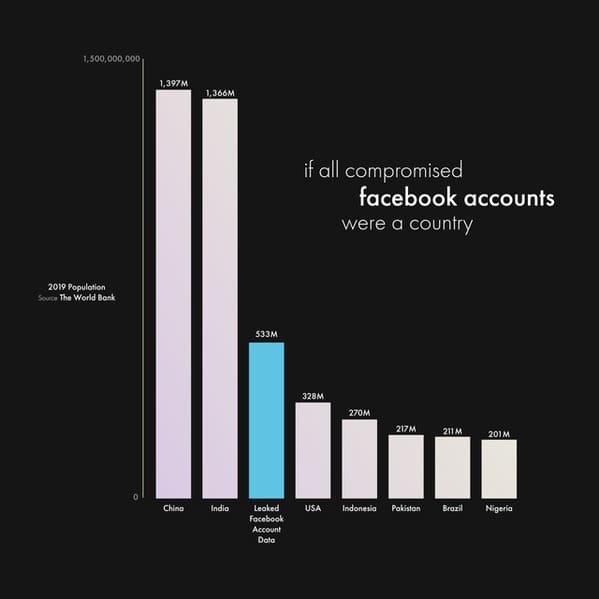
1. Each compromised Facebook account compared with the population of large countries.
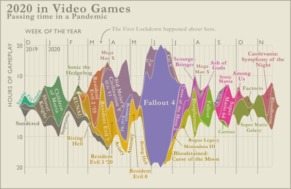
2. This guy’s gaming over the course of 2020.
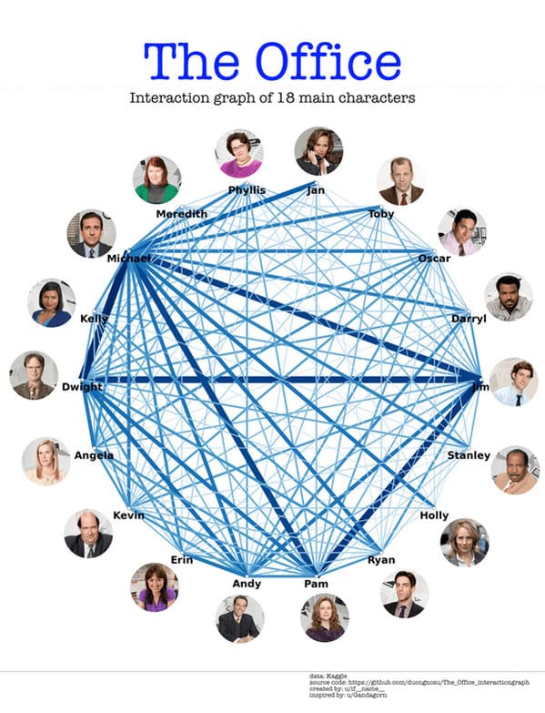
3. Who talks to whom in The Office.
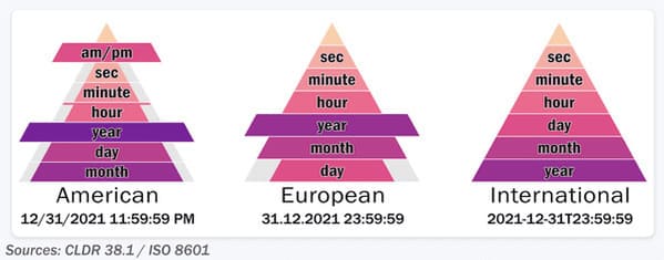
4. Proper use of time and date.
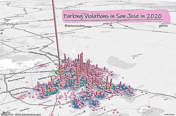
5. Don’t park in this one spot in San Jose.
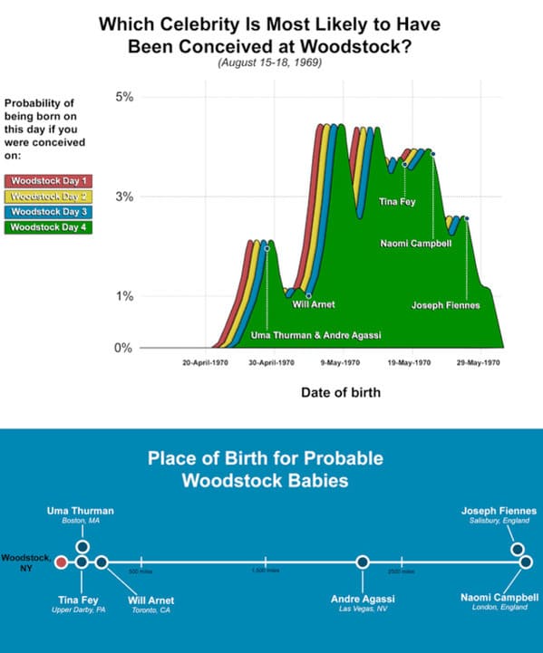
6. Probability you were conceived during Woodstock.
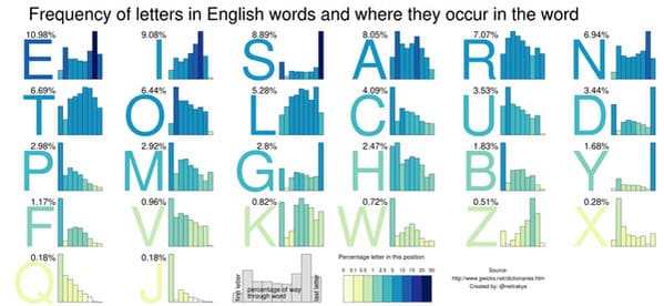
7. Where is the word do these letters land?
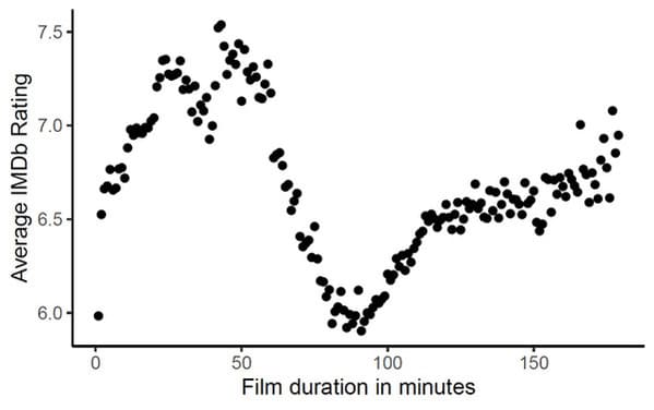
8. If you want to make a great movie, it better be 30 minutes or 3 hours long.
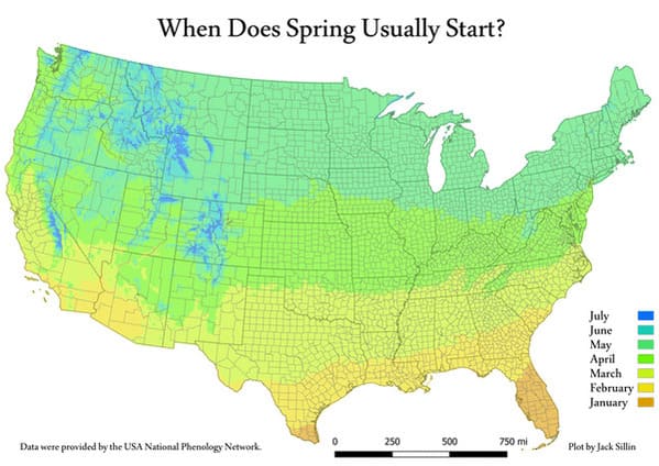
9. When Spring actually starts.
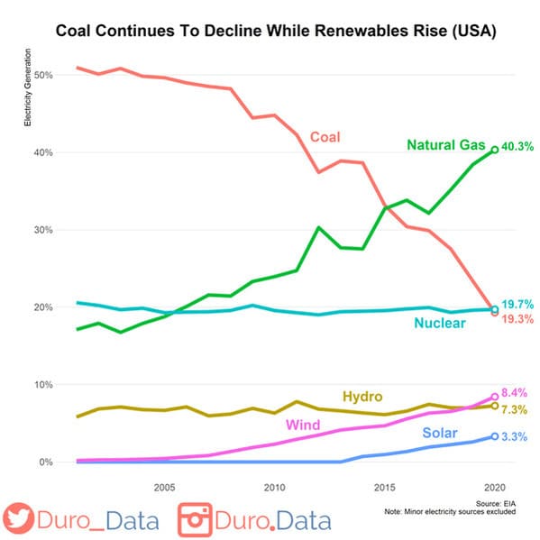
10. Coal is trending down.
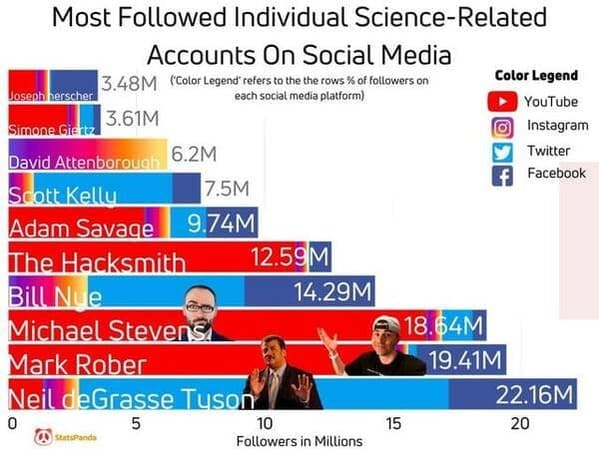
11. Who spreads the most science.
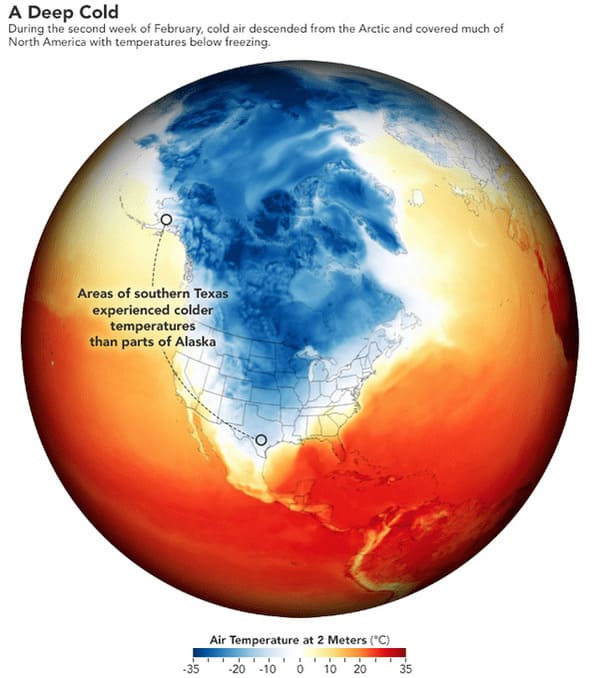
12. How cold was it in Texas, really?
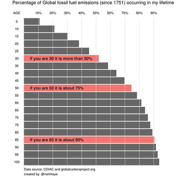
13. Fossil fuels emissions in your lifetime.
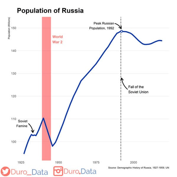
14. Russia’s population dip during the Second World War.
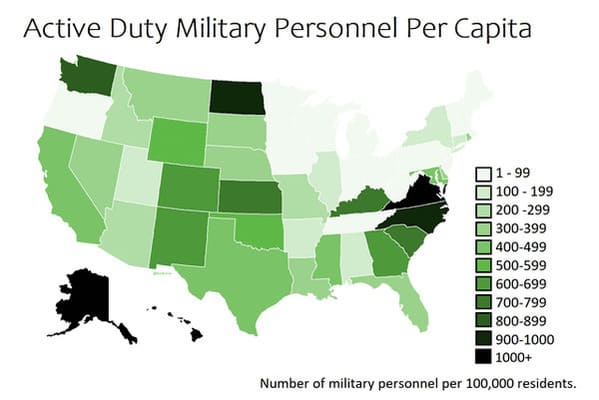
15. Active military personnel by state.
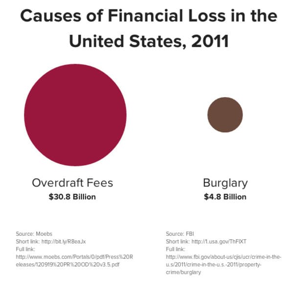
16. Who are the real thieves?
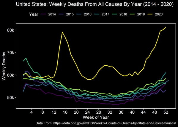
17. Wow. I guess it’s not a hoax after all.
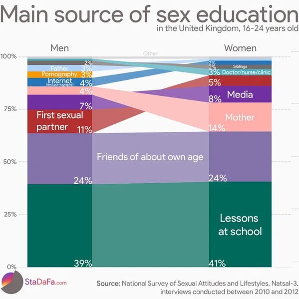
18. The more you know.
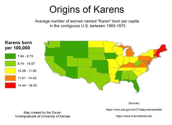
19. Maine exports a lot of Karens.
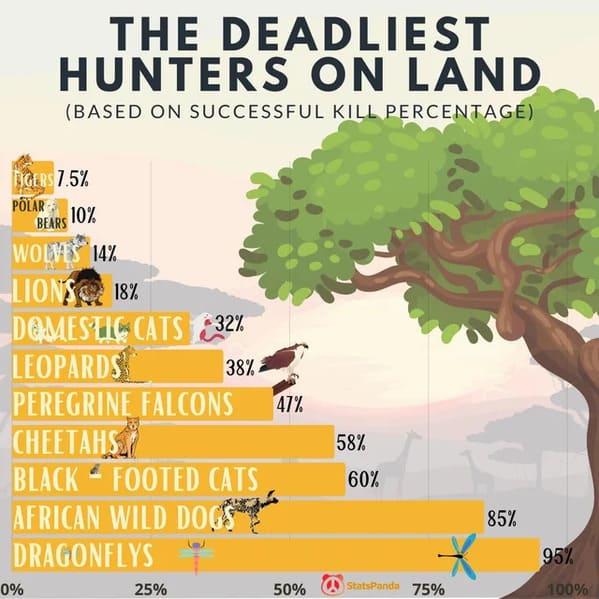
20. Dragonflies are out there doing the most.
h/t Reddit: r/DataIsBeautiful

