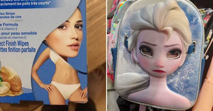
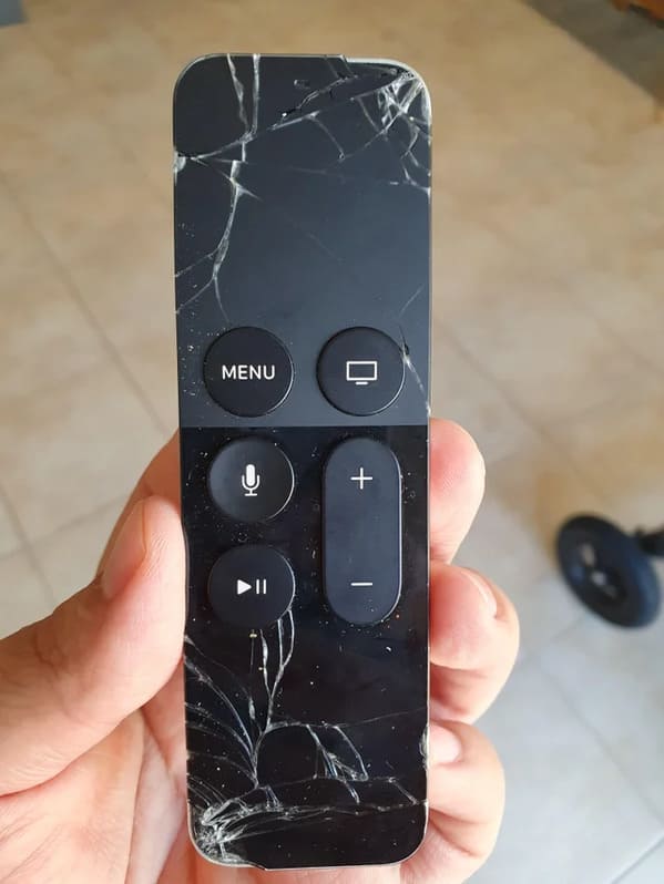
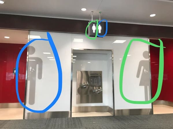
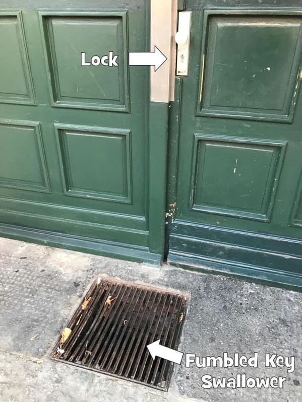
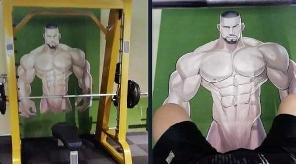
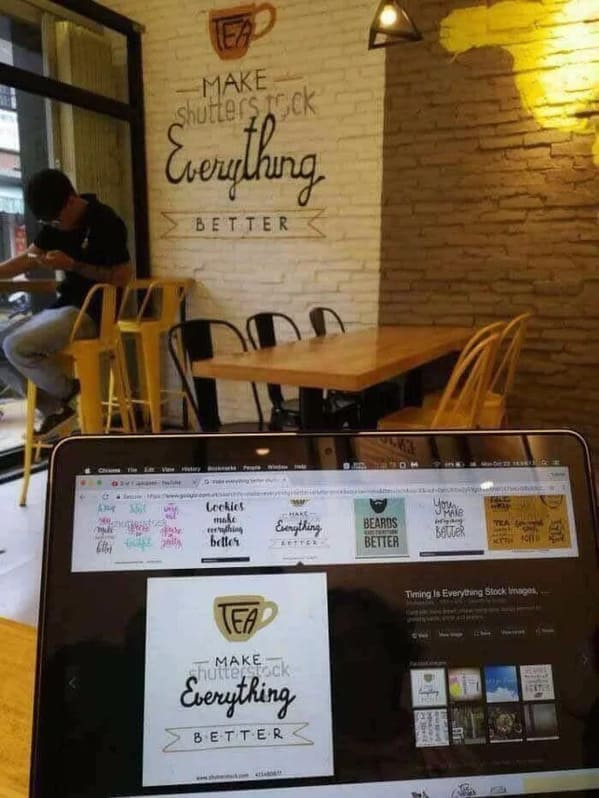
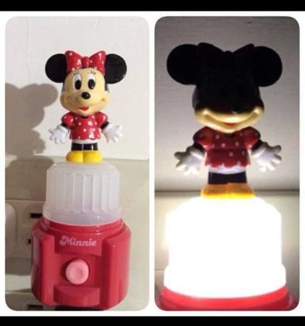
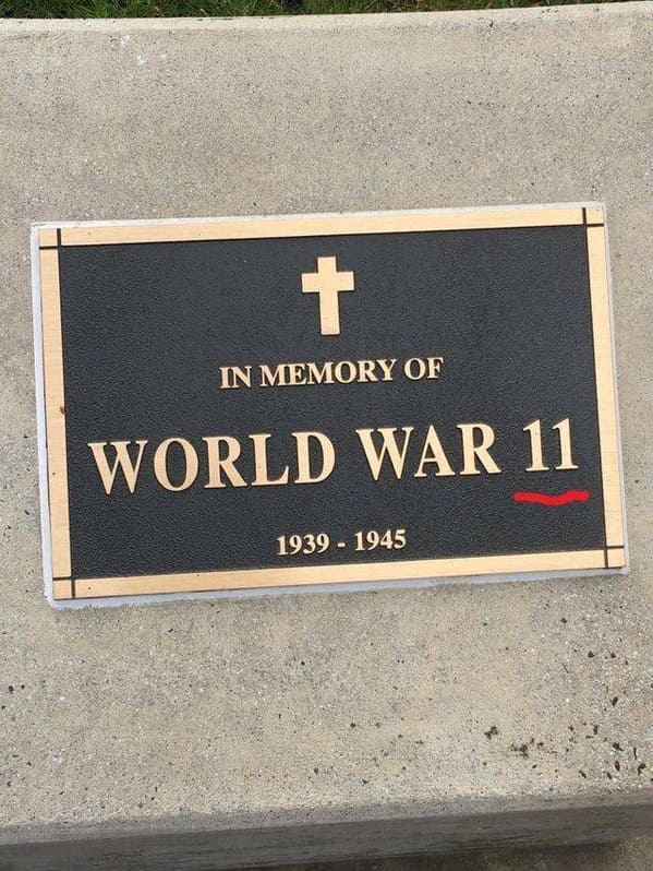
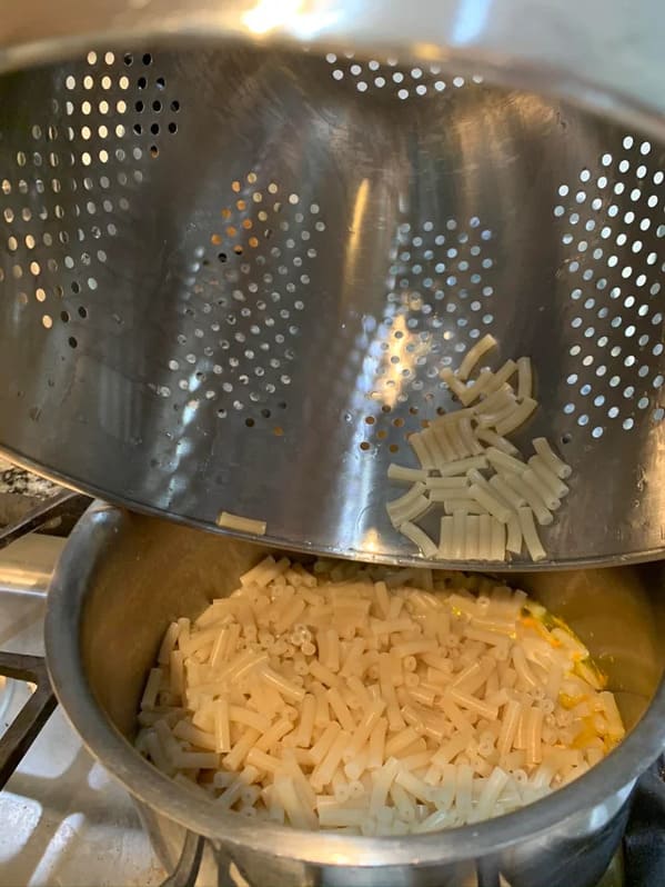
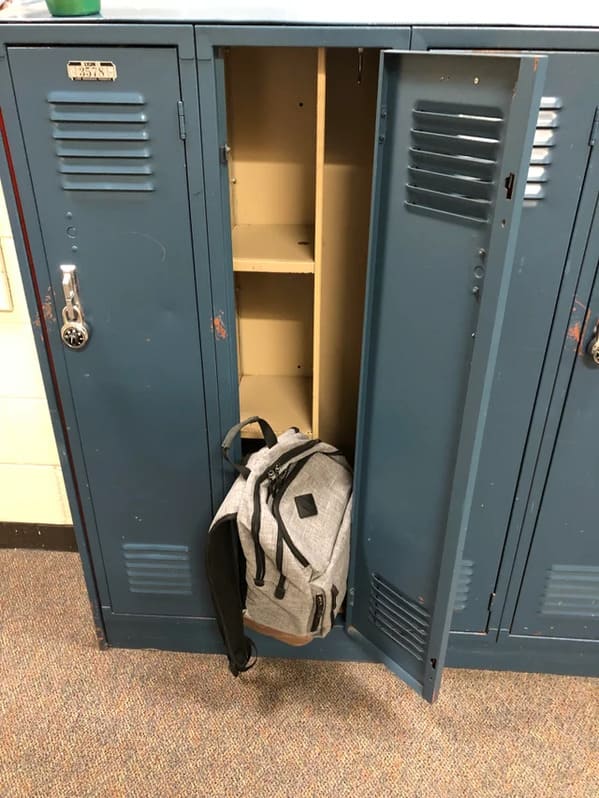
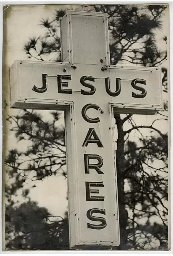
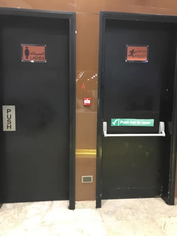
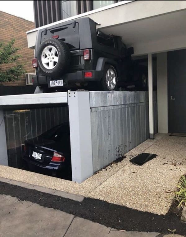
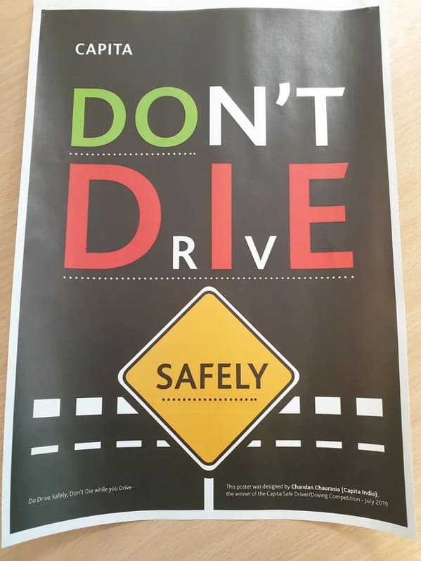
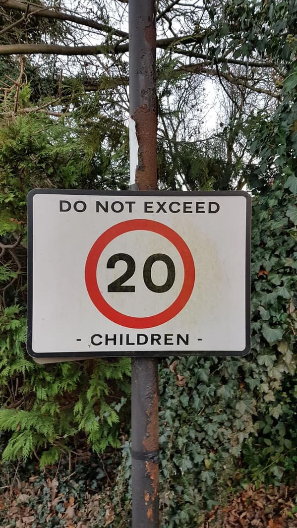
Crappy design is everywhere. In fact, you probably barely notice it until someone else points it out. Then, you can’t unsee it. It’s like the end of The Usual Suspects. The poor design choice was right under your nose. Look, I’m not saying I could do a better job. Frankly, I couldn’t be trusted to make a diorama in school that didn’t look like trash. Literal trash. The janitor threw mine away and I got an F. Anyway, these designs are somehow worse, often to the point of being funny.
If you’re thinking of becoming a designer of any kind, might I suggest going to some sort of school where they teach it? At least you can find out if you’re good at it early on before you ruin a school library or a children’s toy. Not everyone is a visual person. Honestly, I’m more of a writer than anything else, and I suck at that too. So, don’t fret. Plenty of other jobs out there for idiots like us.
For now, let’s enjoy these crappy designs from Reddit.


