People love going to the internet to complain about things. I know I sure do. Especially when I see something designed so poorly that I think it can’t be real.
When you look closer the poorly designed product is always real. There is always someone out there trying to sell turds. Turd selling is as old as people themselves.
Check these turds out:
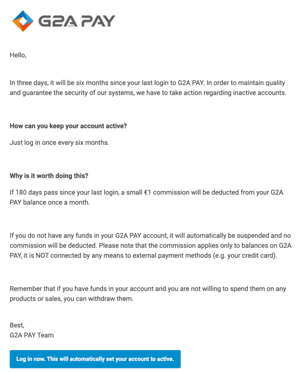
1. Haven’t logged into your free account in a while? We’ll start charging you money
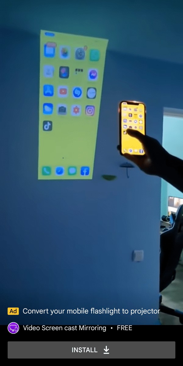
2. This is like the peak of fake ads.
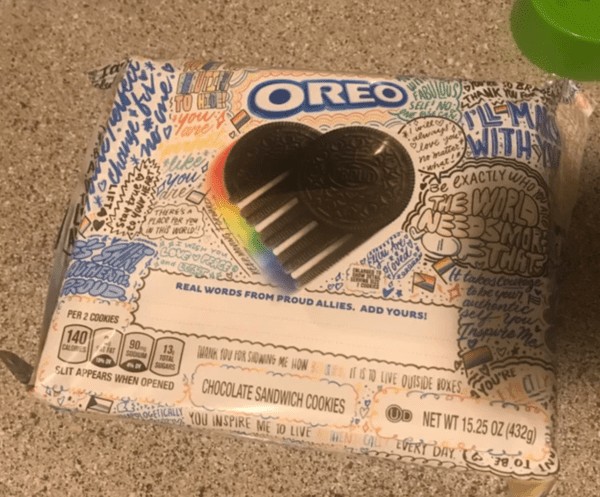
3. These were like $1.50 more than the other Oreos just because of the pride packaging. (No it’s not going to any charity)
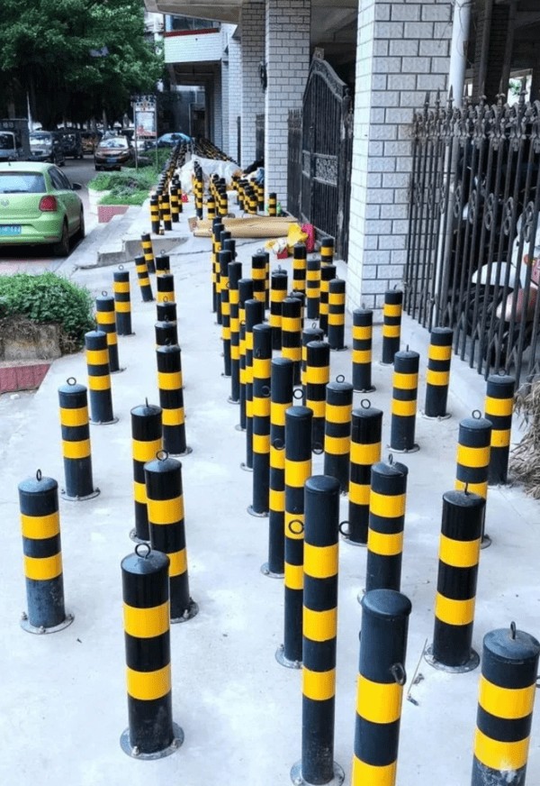
4. Anti rough-sleeper poles make for no-walk sidewalk.
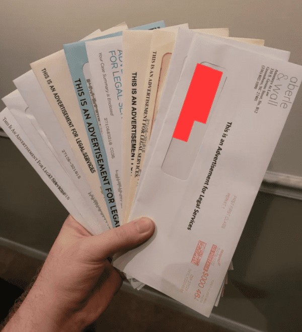
5. I got my first speeding ticket.
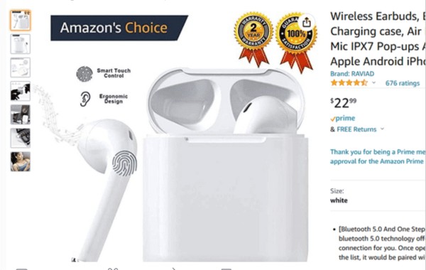
6. Putting the “Amazon’s Choice” logo directly into the product’s image even though it isn’t actually Amazon’s Choice.
7. considering I’m broke this terrified me
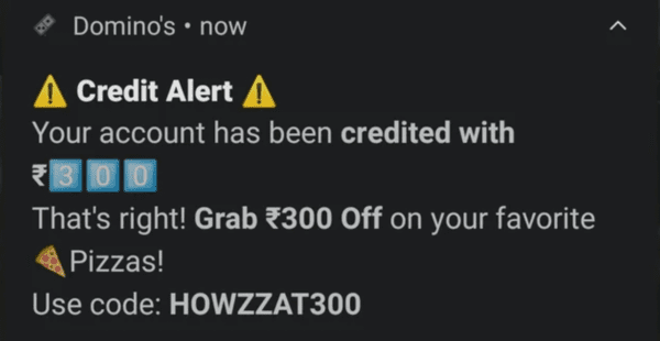
8.
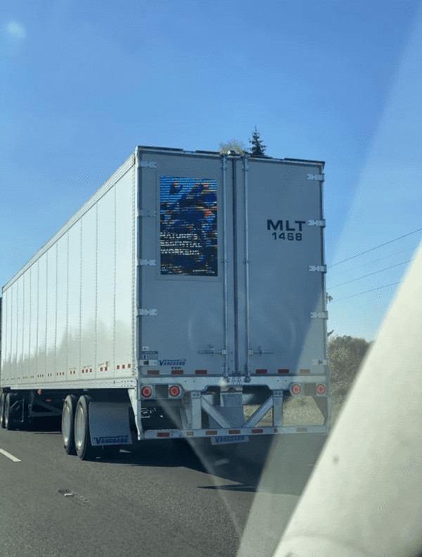
9. Digital ad displays on the back of big rigs. One of the displays said to “Keep your eyes on the road, not on your phone” which switching between ads on the back of the truck.
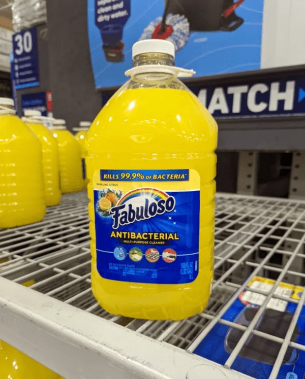
10. Design of the bottle and logo looks way to close to a Sunny D like drink. If a kid couldn’t read this would go bad.
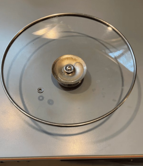
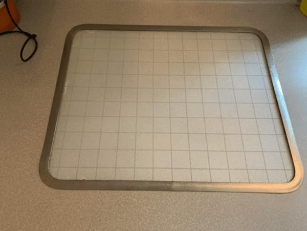
11. Pot lid is like a bath toy bc it holds old nasty swamp water from the dishwasher under the handle. The only way to get the water out is a phillipshead screwdriver. Great job!!
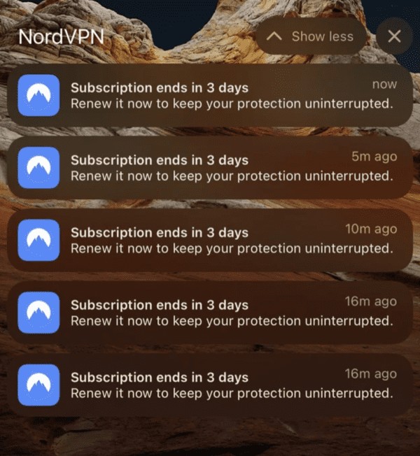
12. NordVPN’s way of begging me for money for the past 16 hours.
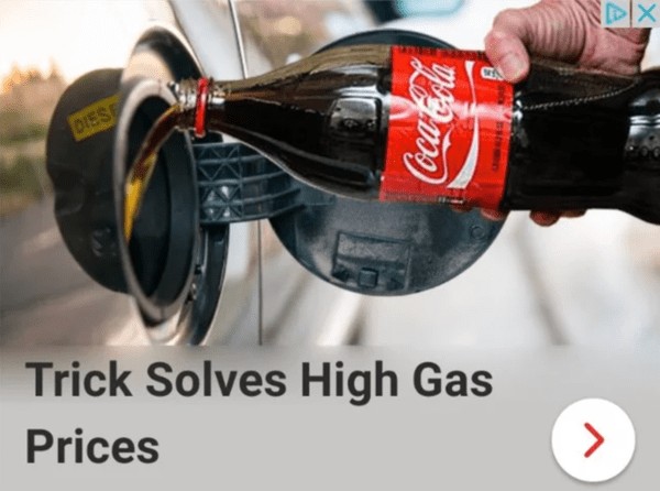
13. Another shameless “destroy your car with coke” ad.
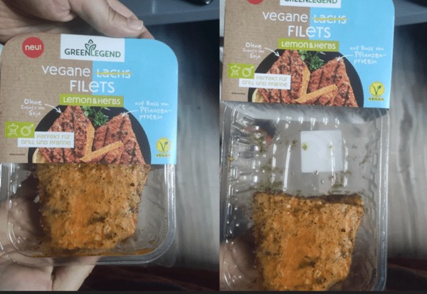
14. Why must you break my heart?
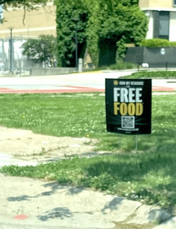
15. This sign proclaiming “FREE FOOD” is located outside a Hardee’s in a low-income area with a large homeless population. It then says “*by joining our rewards program” in small print at the bottom.
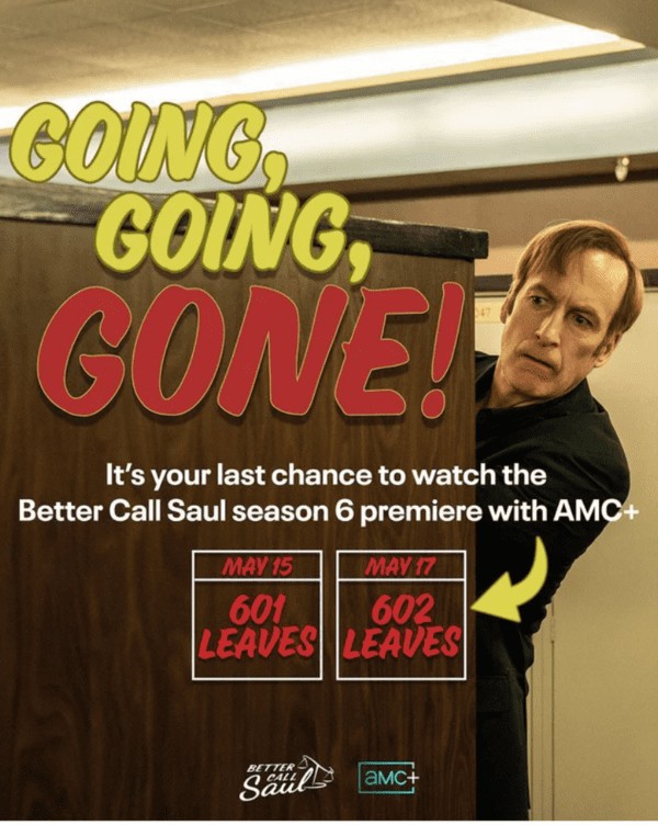
16. The streaming platform AMC plus is removing earlier episodes of the latest season of Better Call Saul so that people can’t wait till the end of the season and subscribe once to binge all episodes.
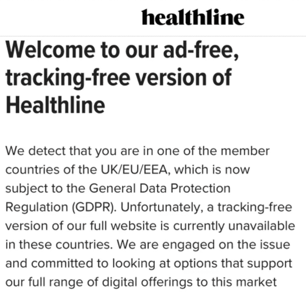
17. Don’t want us to sell your information? Welp, no browsing for you buddy.
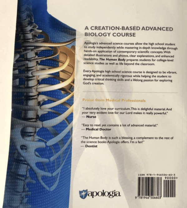
18. This religious biology book features endorsements from totally real people; Nurse, Medical Doctor, and Dentist.
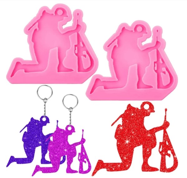
19. Patriotic keychain to honor fallen soldiers…. with the keychain hole in their head.
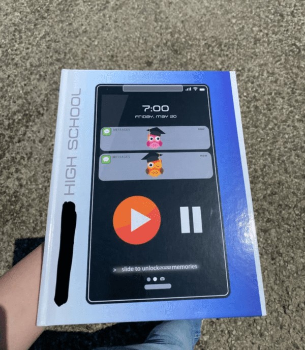
20. I hate the simplicity of our yearbook. It doesn’t even have 2021-2022 on it. Does have 2022, but in such a small place you can barely see it. May 20th is our graduation date, but isn’t even the last day of school, and today is the 16th. Owls aren’t even our mascot.
21. The locked symbol also looks unlocked.
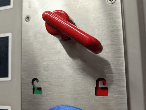
22. Someone’s marketing team should have thought this through.
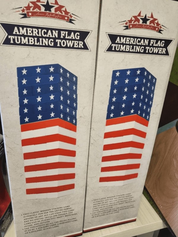
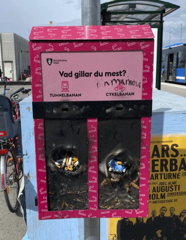
23. Making your cigarette disposal boxes out of flammable material.
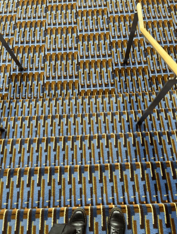
24. These super visible stairs.
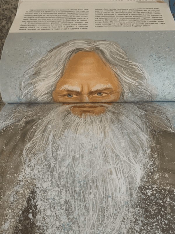
25. haha got your nose.
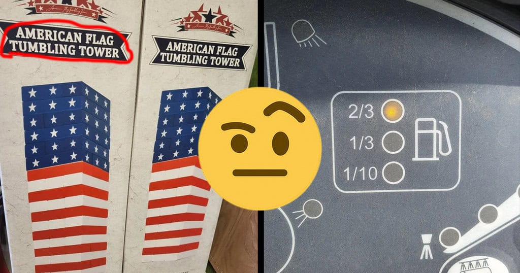
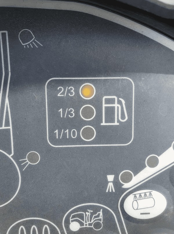
26. This fuel gauge does a pretty bad job at telling how much fuel there is.
27.
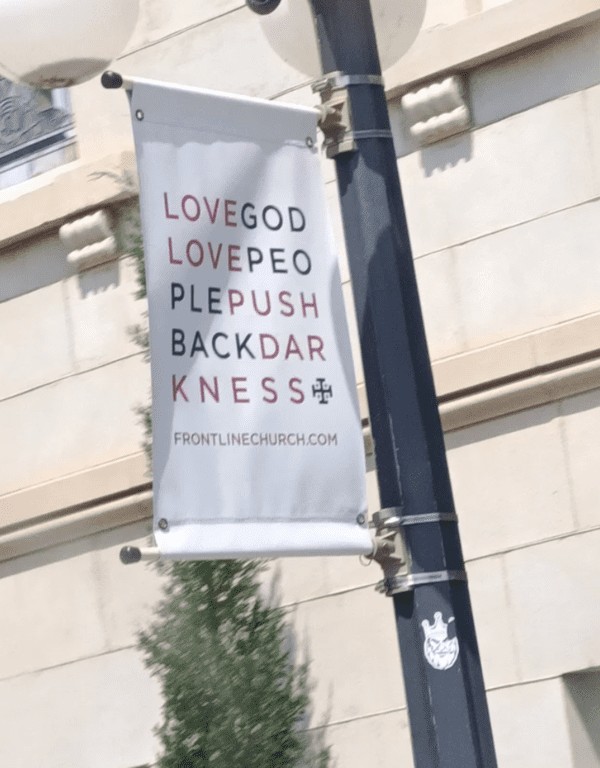
28. This terrible church advert.
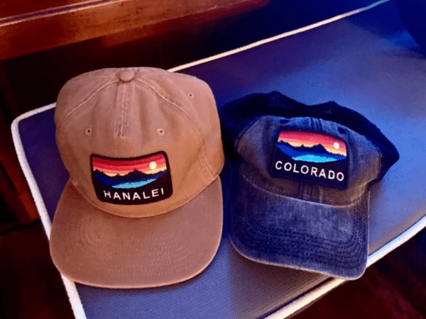
29. My friend’s hat from Hawaii has some remarkably similar scenery to that on my Colorado hat.
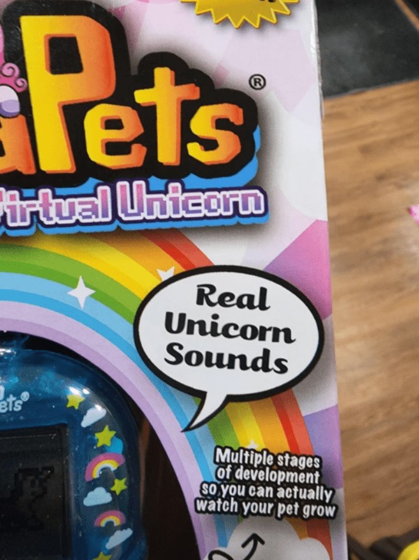
30. How in TF do you pull off marketing REAL UNICORN SOUNDS.
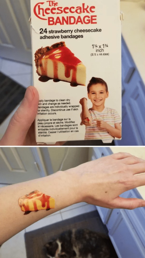
31. Cheesecake bandage looks like a gaping wound.
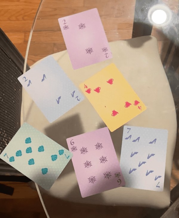
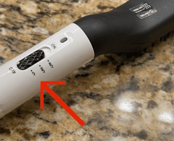
32. My wife bought me a beard straightener. It has a setting that turns your face into an ice cube 0°F (-18°C)
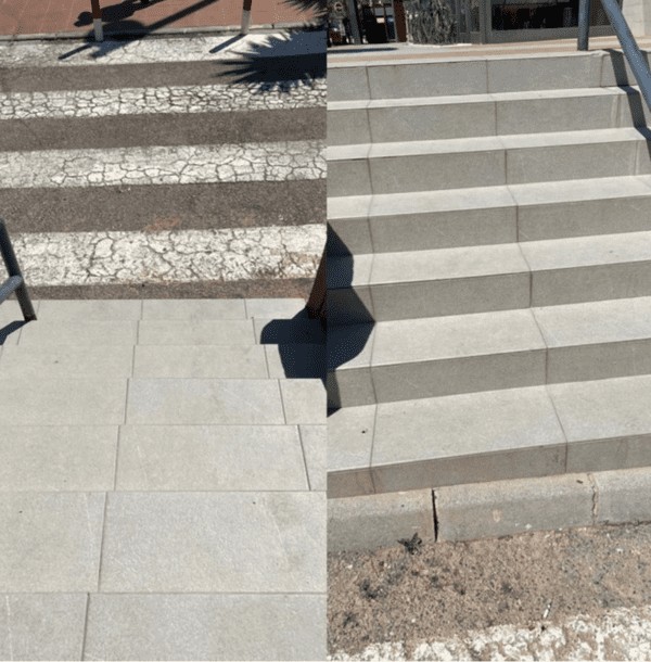
33. Damn near broke my ankle at the bottom of these steps.
34. Imagine being such a bad designer you can destroy a child’s ability to count by them merely looking at your design.
